YUM YUM!
CONTEXT
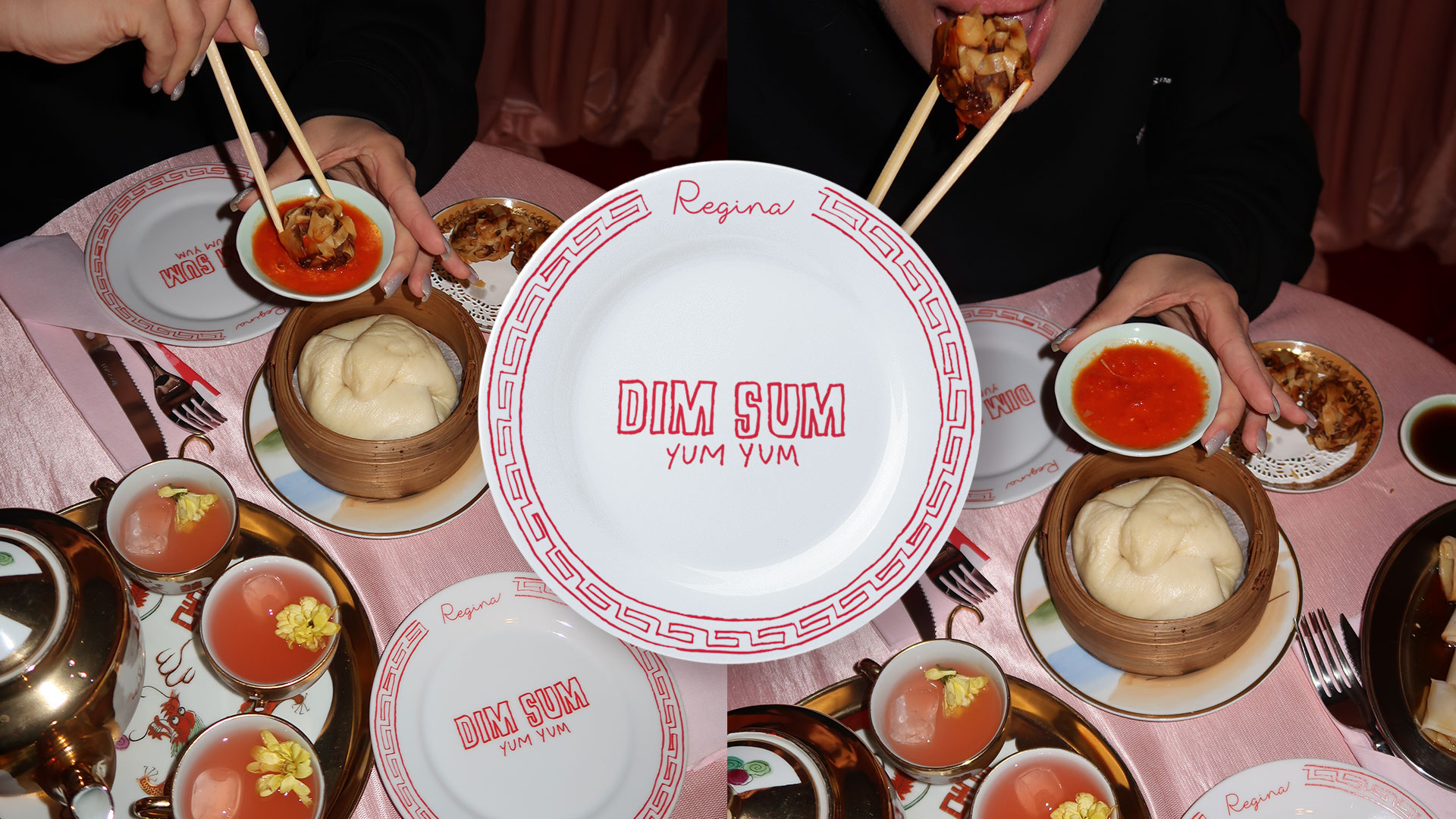
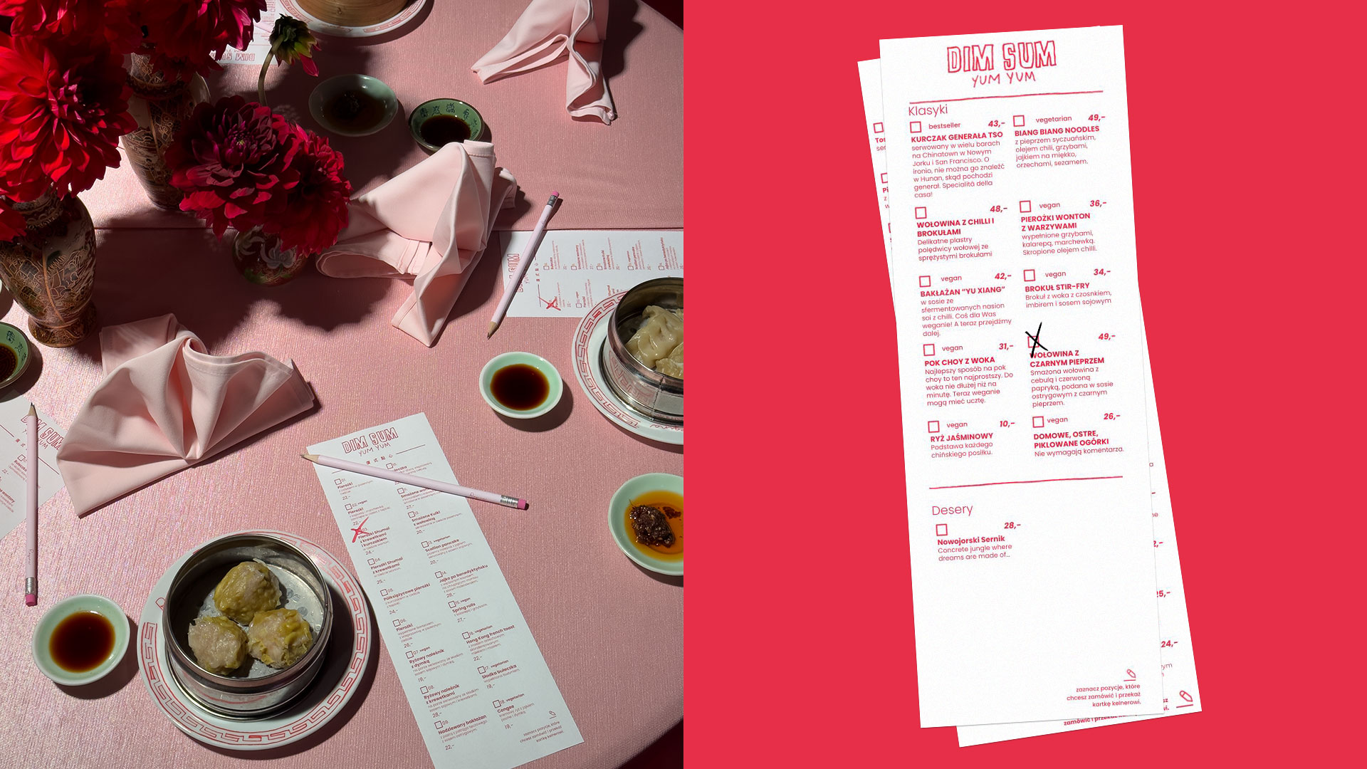
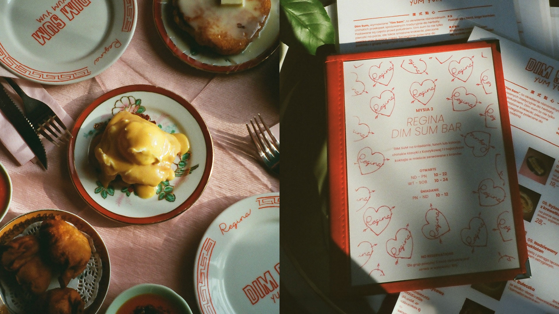
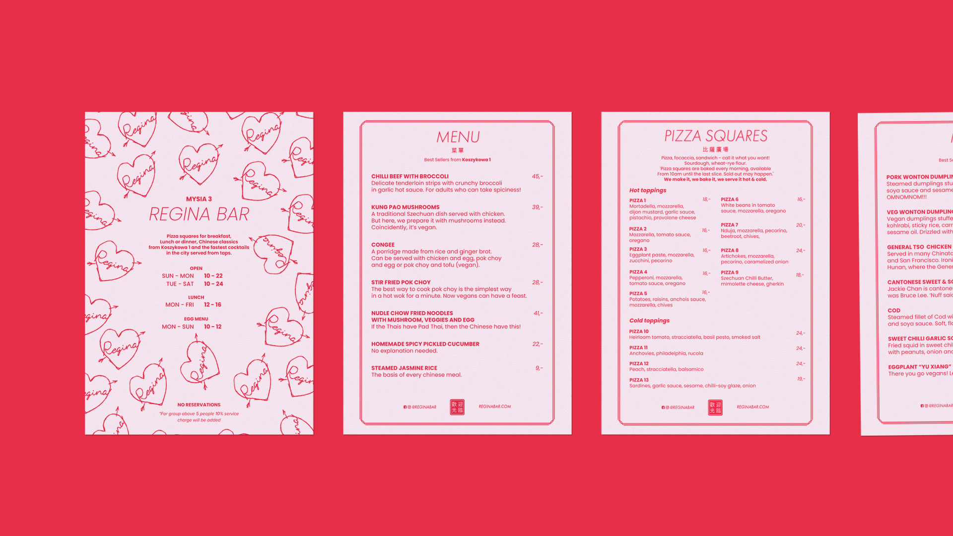
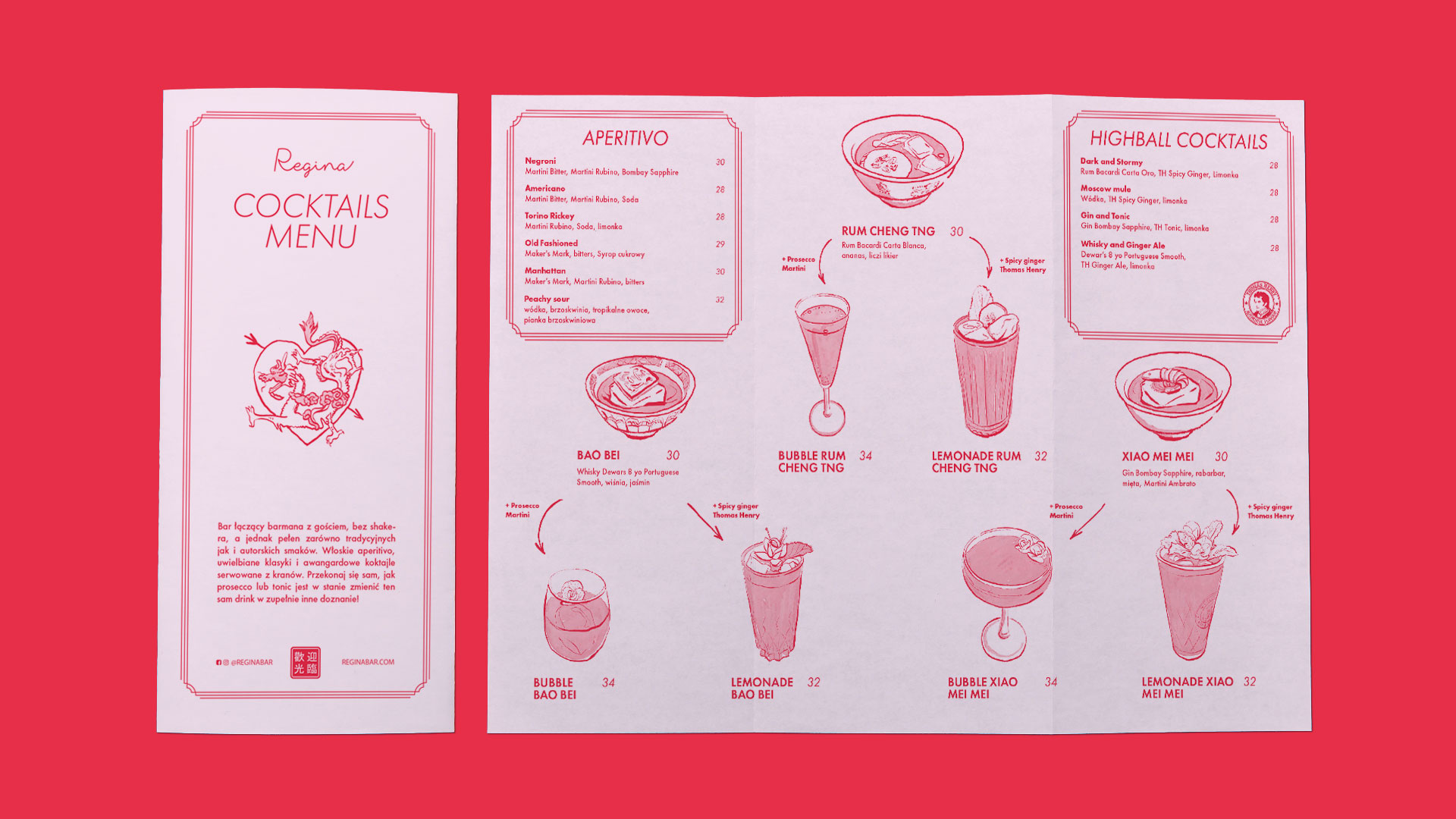
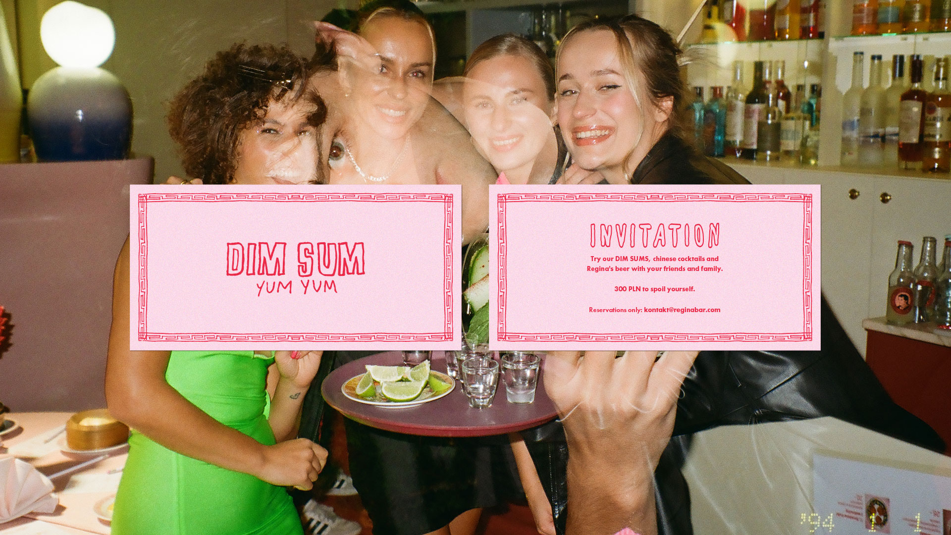
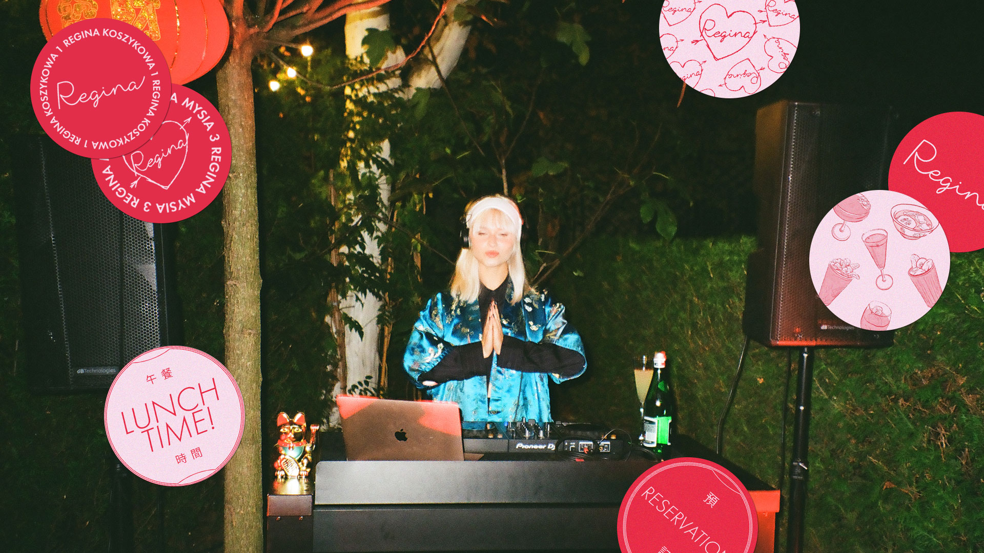
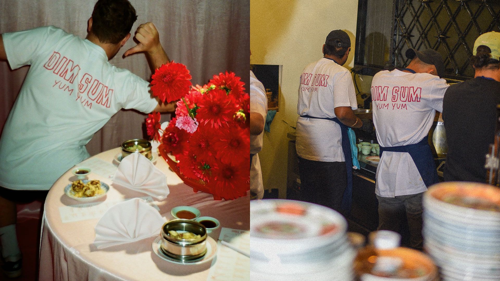
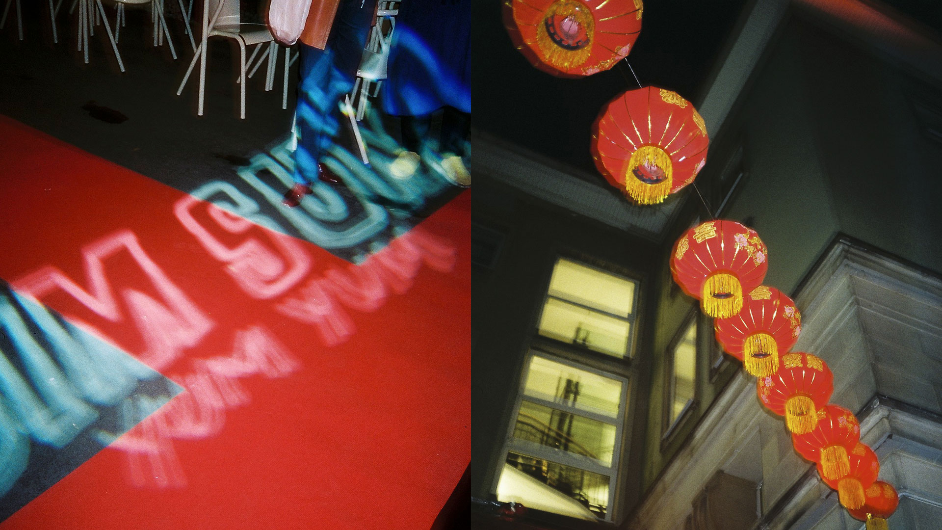
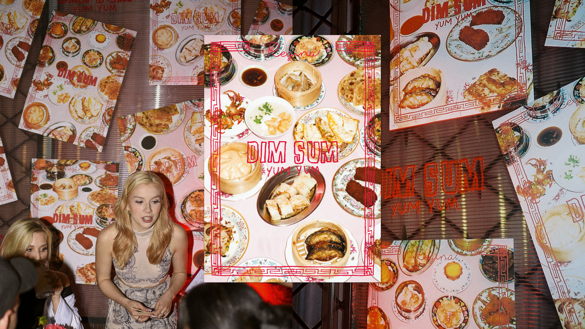
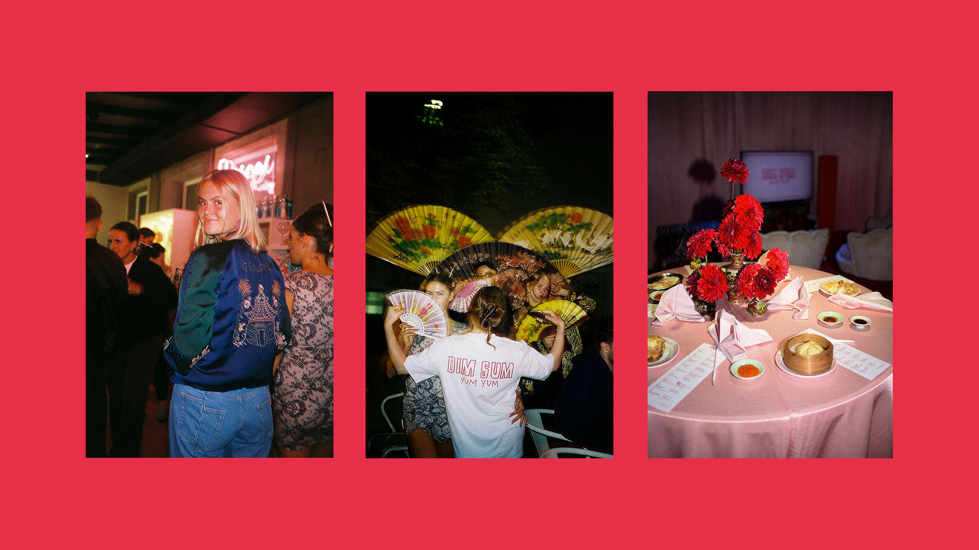
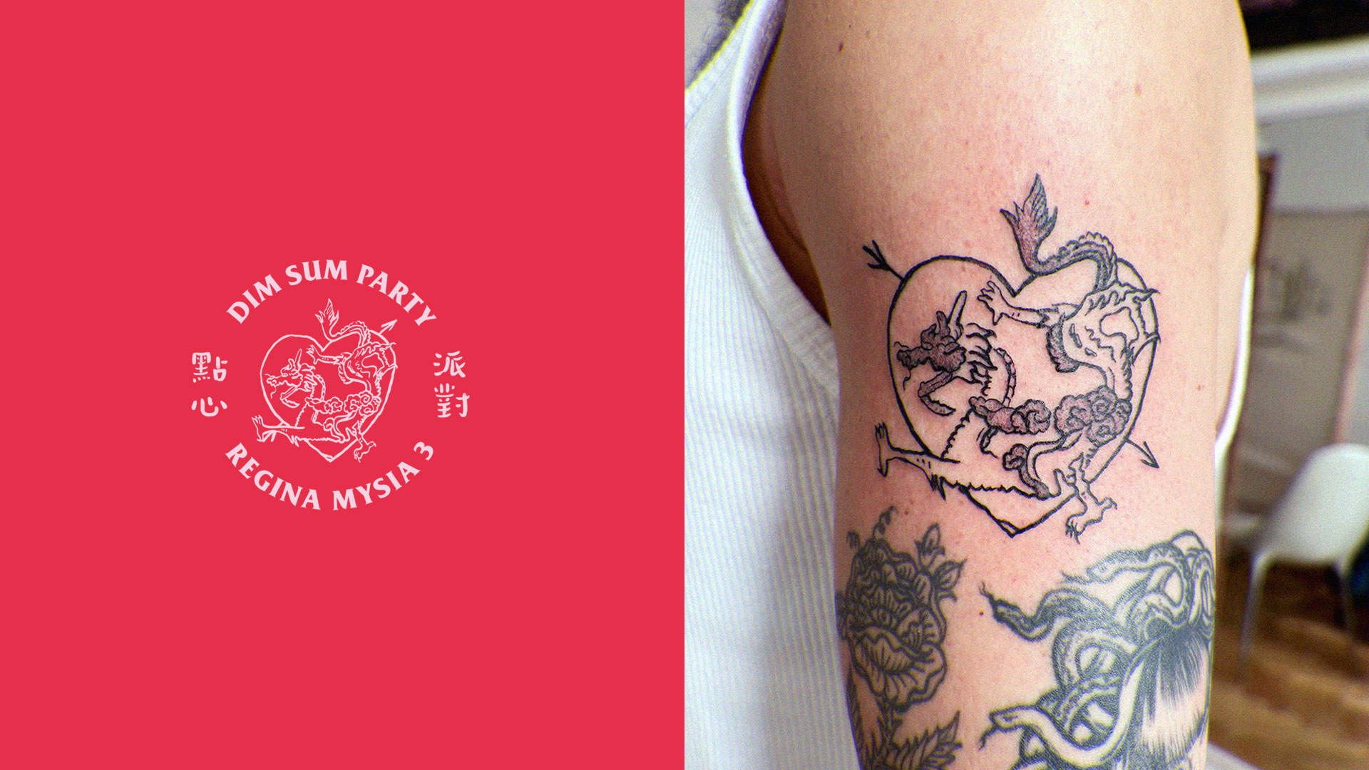
Dim sum yum yum, baby sister of Regina Bar, brings the vibrant spirit of Cantonese cuisine to Warsaw with a playful, modern twist. Visual identity crafted for Dim Sum Yum Yum, capturing its lively essence through bold colors, dynamic typography, and whimsical illustrations.
Inspired by the bustling energy of Asian teahouses and the restaurant’s innovative menu, the design reflects a fusion of tradition and contemporary flair. From logo creation to social media assets, each element is thoughtfully designed to evoke the joy of sharing small, flavorful bites in a cozy, inviting atmosphere. Explore how we translated Dim Sum Yum Yum’s unique charm into a cohesive and captivating brand experience.

SUMMARY
This project showcases our expertise in restaurant branding, food and beverage design, and culturally nuanced visual storytelling. Explore how Studio Whis transformed idea of Dim Sum Yum Yum into a distinctive and cohesive brand that invites discovery, delight, and appetite.
Client:
MOD
Year:
2023
Scope:
Visual Identity
Packaging
Print
DISCOVER MORE PROJECTS