NEW BUSINESS & COLLABORATION

Do you have questions,
comments or general inquiries?
Drop us a line.

LANGUAGE
SITE MAP
Digital
Design
Escinea
CONTEXT

Science-based premium supplements: Escinea is a Polish premium dietary supplement brand distinguished by its scientific approach to health. Its products combine natural ingredients — horse chestnut extract (escin) and chokeberry extract — into unique, patented formulas.

Studio WHIS was invited to design a modern, cohesive, and intuitive digital platform that highlights the brand’s exclusive character, enhances user experience, and streamlines the online purchasing process.


BRAND STORY

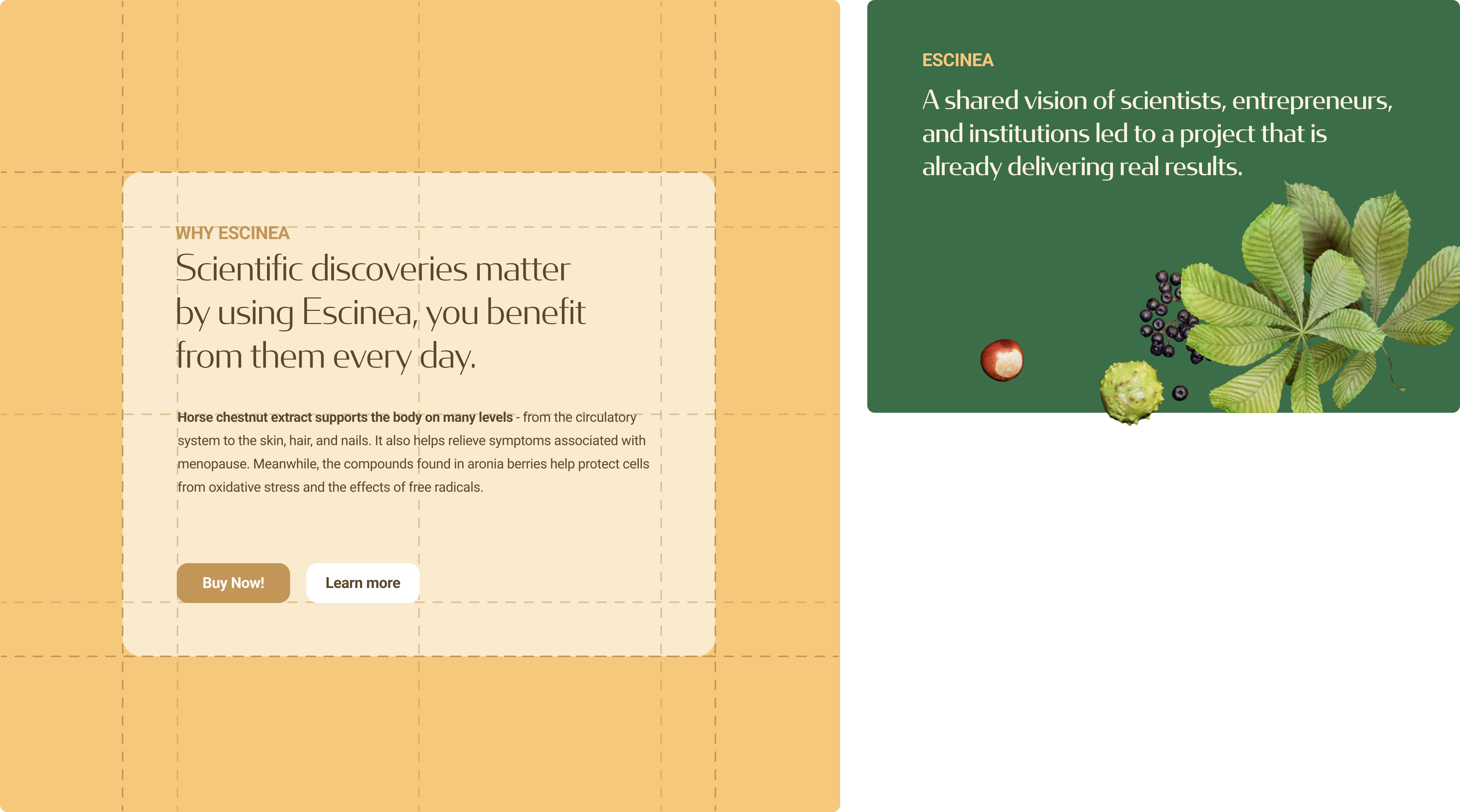
The Escinea brand was born out of inspiration from the health-promoting properties of horse chestnut and chokeberry. A key role in its creation was played by scientific research conducted under the direction of Prof. Katarzyna Koziak at the Medical University of Warsaw.

Prof. Koziak and her research team provided groundbreaking insights into:

  • The molecular mechanisms of escin’s action
  • The impact of escin on blood vessel function
  • Processes related to oxidative stress
  • The synergistic effects of combining horse chestnut and chokeberry extracts


Recognition for innovation:
Prof. Katarzyna Koziak, the creator of Escinea’s innovative formula, was a finalist in the 16th edition of the “Sukces Pisany Szminką” competition in the “Leader in New Technologies” category. Experts highlighted her contribution to the development of modern medicines and supplements, emphasizing the unique combination of natural plant ingredients with contemporary scientific achievements.

Institutional support:
The research was made possible thanks to funding from:

  • The National Centre for Research and Development (NCBR)
  • The Foundation for Polish Science (FNP)


Commercialization of the research results was supported by:

  • The Polish Agency for Enterprise Development (PARP)
  • The Polish Investment and Trade Agency (PAIH)
  • The Mazovian Unit for Implementation of EU Programmes (MJWPU)
 
 
#CaseStudy #UXDesign #UIDesign #Ecommerce #Branding #HealthAndWellness #PremiumBrand #DigitalDesign #StudioWHIS
CHALLENGES
  1. Unclear brand communication
    The previous website did not clearly explain what Escinea supplements are or what benefits they offer. It lacked a defined consumer profile, emotional storytelling, and trust-building elements such as testimonials, certificates, or expert endorsements.

  2. Difficult content navigation
    The information architecture was flat and unintuitive. Users had to scroll through long text blocks to reach key information. The site lacked hierarchy, micro-navigation, and logical content structure.

  3. Limited interaction points (CTAs)
    Action buttons such as “Buy now” appeared only occasionally. There were few engagement triggers or clear marketing messages, and the e-commerce flow did not effectively guide users through the purchasing journey.

  4. Outdated look and lack of visual consistency
    The old version of the website did not reflect the brand’s premium character. The typography and graphics were inconsistent, and the overall design did not align with Escinea’s visual presence on social media.


#CaseStudy #UXDesign #UIDesign #Ecommerce #Branding #HealthAndWellness #PremiumBrand #DigitalDesign #StudioWHIS
OUR SOLUTIONS
  1. Clear target group and communication strategy
    We defined the consumer profile — individuals seeking high-quality supplements who value lifestyle, quality, and aesthetics. We developed a new tone of voice based on clarity, credibility, and scientific substance. As a result, the brand became more relatable and understandable to its audience.

  2. New information architecture
    We created a structure based on logical sections: what the product is, who it’s for, ingredients, effects, benefits, and reviews. We added micro-navigation, allowing users to quickly find relevant content. The website became clear and intuitive, with key information visible at first glance.

  3. Strategic placement of CTAs
    We designed an interaction system across all stages of the user journey. “Buy now” and “View product” buttons appear in hero, descriptive, and comparison sections, increasing conversions and simplifying the purchase decision.

  4. Consistent visual language and modern UI
    We introduced a minimalist, elegant design that reflects the brand’s premium character. The new visual system uses a unified color palette, refined typography, and graphic elements inspired by the worlds of beauty and science. It ensures consistency across the website, social media, and marketing materials.

  5. Enhanced responsiveness and accessibility
    We optimized the mobile shopping experience for users who primarily browse on their phones. The flow was streamlined to shorten the path to purchase, while accessibility (WCAG) improvements made the website more user-friendly and inclusive.


#CaseStudy #UXDesign #UIDesign #Ecommerce #Branding #HealthAndWellness #PremiumBrand #DigitalDesign #StudioWHIS
SUMMARY

The new Escinea platform delivers a modern and functional digital experience that strengthens the brand’s premium image. Through clear communication and refined UX/UI design, the brand gained a tool that:

  • builds trust and transparency,

  • increases user engagement,

  • effectively supports online sales,

  • and conveys Escinea’s unique identity in the digital space.

The project transformed Escinea from a functional e-commerce website into a comprehensive premium brand experience — one that successfully converts conscious consumers and fosters long-term loyalty.


PROJECT DETAILS

Escilab 

2025

UX strategy
UI design
3D Animations
Web design
Content architecture
E-commerce optimization